分类器模型评估
分类器根据真实值和预测值都会得到一个混淆矩阵:
| 混淆矩阵 | 预测值-正 | 预测值-负 |
|---|---|---|
| 真实值-正 | TP | FN |
| 真实值-负 | FP | TN |
1.根据混淆矩阵得到的计算指标
1.准确率(accuracy):\[accuracy = \frac{TP + TN}{TP + FN + FP + TN}\] 2.召回率/查全率(recall):\[recall = \frac{TP}{TP +FN}\] 3.精准率/命中率/查准率(precision):\[precision = \frac{TP}{TP +FP}\] 4.覆盖率/敏感度(sensitivity):同召回率 5.负例覆盖率/特异度(specificity):\[specificity = \frac{TN}{TN + FP}\] 6.假阳性率(False Positive Rate | FPR)[ROC曲线横坐标]:\[FPR = \frac{FP}{FP + TN} = 1 - specificity\] 7.真阳性率(True Positive Rate | TPR)[ROC曲线纵坐标]:同召回率/敏感度 8.预测为正比例(depth):\[depth = \frac{TP + FP}{TP + FN + FP + TN}\] 9.提升度(lift):\[lift = \frac{precision}{\frac{TP + FN}{TP + FN + FP + TN}}\] 10.增益(gain):\[gain = \frac{TP}{TP + FP} = precision\] 11.F1-score(recall与precision的调和平均数,中和recall与precision的影响,越大越好):\[F1-score = \frac{2\times precision\times recall}{precision + recall} = \frac{2\times TP}{2\times TP + FN +FP}\]
2.评估曲线及曲线线面积
1.ROC曲线及曲线下面积AUC
描述不同阈值下,FPR与TPR的轨迹
x-轴:FPR
y-轴:TPR
ROC曲线全称为受试者工作特征曲线(Receiver Operating Characteristic Curve).
曲线越靠近左上角模型准确度越高,模型效果越理想;
曲线下面积(AUC值)越大模型准确度越高,模型效果越理想.
library(yardstick)
library(tidyverse)
data(two_class_example)
# ROC曲线下AUC值-------------------------------------------
roc_auc(two_class_example, truth, Class1)## # A tibble: 1 x 3
## .metric .estimator .estimate
## <chr> <chr> <dbl>
## 1 roc_auc binary 0.939# 绘制ROC曲线----------------------------------------------
# 手动绘图
roc_curve(two_class_example, truth, Class1) %>%
ggplot(aes(x = 1 - specificity, y = sensitivity)) +
geom_path() +
geom_abline(lty = 3) +
coord_equal() +
theme_bw()
# 自动绘图
roc_curve(two_class_example, truth, Class1) %>%
    autoplot()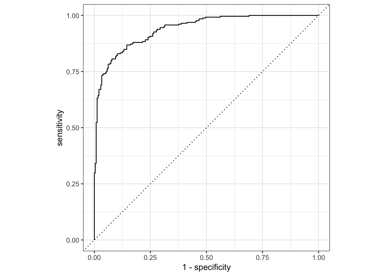
2.P-R曲线及曲线下面积AUC
描述不同阈值下,recall与precision的轨迹
x-轴:recall
y-轴:precision
P-R曲线越靠近右上角模型准确度越高,模型效果越理想;
P-R曲线下面积越大模型准确度越高,模型效果越理想.
# P-R曲线下AUC值-------------------------------------------
pr_auc(two_class_example, truth, Class1)
## # A tibble: 1 x 3
## .metric .estimator .estimate
## <chr> <chr> <dbl>
## 1 pr_auc binary 0.943# 绘制P-R曲线----------------------------------------------
# 手动绘图
pr_curve(two_class_example, truth, Class1) %>%
ggplot(aes(x = recall, y = precision)) +
geom_path() +
coord_equal() +
theme_bw()
# 自动绘图
pr_curve(two_class_example, truth, Class1) %>%
    autoplot()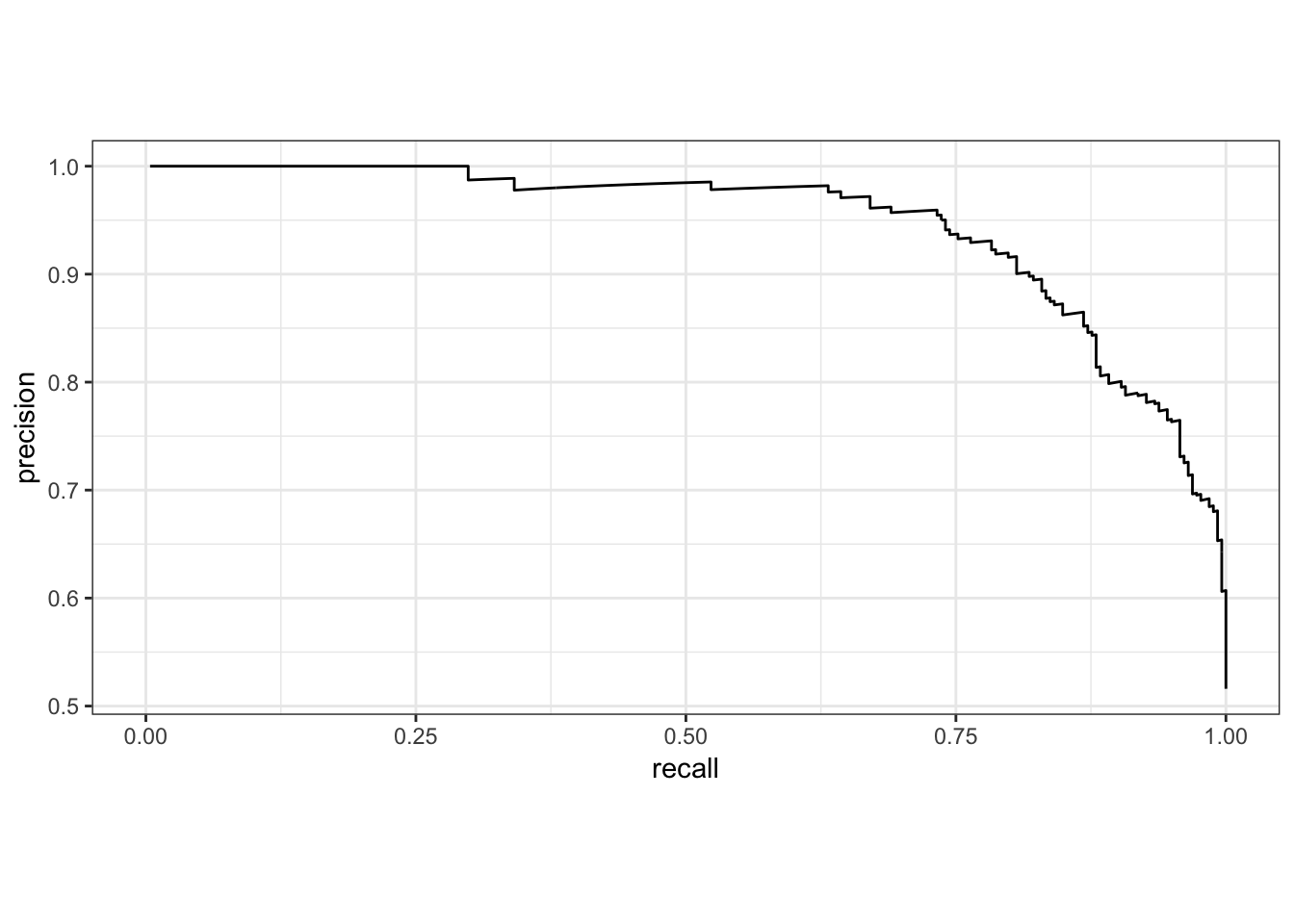
3.lift-curve
描述不同阈值下,lift与depth的轨迹. 衡量与不利用模型相比,预测能力提高了多少.
分类器获得的正例数量和不是用分类器随机获得的正例数量的比例.
x-轴:depth值
y-轴:
lift-curve在很高的lift值保持一段时间后,迅速下降为1为优(偏离baseline足够远)
lift_curve(two_class_example, truth, Class1)## # A tibble: 501 x 4
## .n .n_events .percent_tested .lift
## <dbl> <dbl> <dbl> <dbl>
## 1 0 0 0 NaN
## 2 1 1 0.2 1.94
## 3 2 2 0.4 1.94
## 4 3 3 0.6 1.94
## 5 4 4 0.8 1.94
## 6 5 5 1 1.94
## 7 6 6 1.2 1.94
## 8 7 7 1.4 1.94
## 9 8 8 1.6 1.94
## 10 9 9 1.8 1.94
## # ... with 491 more rows# 绘制lift-curve----------------------------------------------
lift_curve(two_class_example, truth, Class1) %>%
autoplot()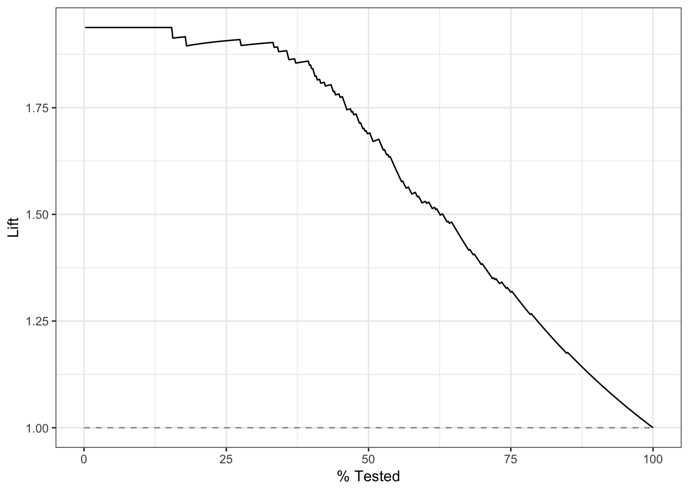
4.gain-curve
描述不同阈值下,precision与depth的轨迹.
x-轴:depth值
y-轴:累计gain值
gain-curve快速上升到1为优.
gain_curve(two_class_example, truth, Class1)## # A tibble: 501 x 4
## .n .n_events .percent_tested .percent_found
## <dbl> <dbl> <dbl> <dbl>
## 1 0 0 0 0
## 2 1 1 0.2 0.388
## 3 2 2 0.4 0.775
## 4 3 3 0.6 1.16
## 5 4 4 0.8 1.55
## 6 5 5 1 1.94
## 7 6 6 1.2 2.33
## 8 7 7 1.4 2.71
## 9 8 8 1.6 3.10
## 10 9 9 1.8 3.49
## # ... with 491 more rows# 绘制lift-curve----------------------------------------------
gain_curve(two_class_example, truth, Class1) %>%
autoplot()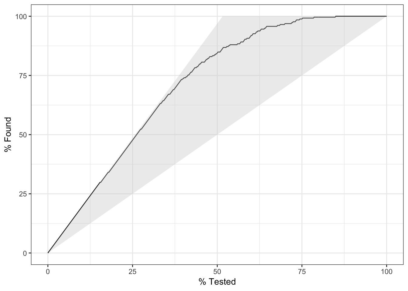
# 得到类似AUC的gain-curve衡量指标
gain_capture(two_class_example, truth, Class1)
## # A tibble: 1 x 3
## .metric .estimator .estimate
## <chr> <chr> <dbl>
## 1 gain_capture binary 0.879